 |
You can create forms for your Web site which allow users to send you information such as their name and address or a response to a query. There are three parts to a Form: the first part consists of the form elements which are viewed on the screen, which allow the user to enter information in response to questions, or select from available options. You draw these elements using tools in Freeway. The second part consists of the instructions which have to be given directing the computer what to do with the information entered using the form elements - where the information is to go, and what is to be done with it, for example. These instructions need to be entered into the Forms dialog on Freeway's Page menu. The third and final part is a script, program or other service hosted on the Web server which deals with the information which is sent back from the completed form. Typically form processing is handled by Perl scripts, located in the CGI-BIN directory of the server. This aspect is normally handled by the system administrator of the Web server. If you are publishing your site through an Internet Service Provider, you must contact them to see what options are available to you - often there are existing Perl scripts which you may use, or occasionally you may be able to upload your own. Freeway provides an easy-to-use interface which allows you to deal with the first and second parts of the process. Using the form tools, you can create form elements or controls on your Freeway page. The Tools Palette provides six tools for use in creating form frames - Checkbox, Radio button, Button, Text field, Popup menu or List, and Text Area. Form elements are a unique type of item within Freeway, and behave in a similar way to boxes containing Plug-in content. You create them in the same way as you create other items, but once they are drawn you cannot convert them to another format. You cannot overlap form elements - if you do, the item at the back will "overflow", and not reproduce on output. To create a form element: 1. Select the tool for the type of form control you want. 2. Place the cursor on the page and drag to draw a box. 3. The form control will be displayed when you release the mouse. You can move and resize form frames as you can any other box. You can select options for form controls using the Inspector palette Item panel and Form Control panel. The options available to you in the form control panel will depend on the type of element in question. There follows a description of each of the six types of form control.
Checkboxes are used to allow visitors to choose from a number of options, where they are allowed to choose more than one option at a time. You create a checkbox for each option. You are not limited by Freeway as to the number of options you can create, or the number the visitor is able to turn on at one time. They may elect to select none, one or two or more of the options you offer them.
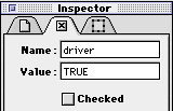
Checkbox optionsAfter you have drawn a checkbox, you can set its options using the Item panel and Form element panel in the Inspector palette.
Title (Item panel) This is the title of the item on the Freeway page as shown in the Site palette. It also controls the label of the checkbox as shown on the page in Freeway and on the Web page. You need to give each checkbox an appropriate title. Name This is the name which identifies each individual checkbox. By default this is set to the same as the current value for Title, but you can specify your own text if you wish. This is not displayed on the page, but is sent back as part of the response when the form is submitted. Value This is the value that is sent to the server if this item is active when the form is sent. It defaults to nothing, and this is usually suitable since it will send a default value of "ON" back to the server, though you may wish to change it to something like "Yes" if this makes more sense in the context of the information that is being requested. You don't need to change this option unless you want to. Checked This determines whether the checkbox is checked or not when the page is first viewed. Checkboxes are unchecked by default when you create them.
Radio buttons are used to allow viewers to choose between a number of mutually exclusive options. Radio buttons are grouped in clusters. Only one of the buttons in a cluster can be active at a time. When a new one is clicked, it turns the previously active button off. You can have several clusters of radio buttons on a page, as long as the buttons in each cluster share a common value for their Name which is different for each cluster.
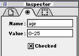
Radio button optionsYou can set the Radio button options using the Item panel and Form element panel in the Inspector palette.
Title (Item panel) Enter the title of the radio button here - this is the label for the item which is shown on the page. The default entry is the default title of the item on the Freeway page. Name This option is the name of the cluster that the button belongs to. By default it is "Cluster1". Enter a new Name here if you want your radio button to belong to a new cluster of buttons. Value This is the information which is sent back to the server if this button is active when the form is sent. By default this is set to the same as the current value for Title, but you can specify your own text if you wish. Checked You can set the state of the radio button (on or off) when the page is first viewed. For each cluster of radio buttons (i.e. each group of radio buttons which share the same Name) you must ensure that one (and only one) is checked.
There are three types of button - Submit, Reset and Button. You must add a Submit button to your form, so that the visitor can send the completed form to the server.
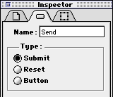
A Reset button is optional it clears the form completely if required, for example if the user has made a series of errors while completing the form, or wishes to reset the form to its initial state for any reason. A "Button" button is not used for conventional forms, but can be used to execute a JavaScript command. Button optionsYou can set the Button options using the Item panel and Form element panel in the Inspector palette.
Title (Item panel) This is the title of the item as shown in the Site palette, and also the text which is shown on the button in Freeway and on the Web Page. Name This is used in JavaScript to identify the button. You do not need to set this option for normal forms. Type These radio buttons allow you to set the button to Submit, Reset or Button as described above.
A text field provides an area one line deep where your viewer can add text. You can set the number of characters the field will accept and the physical size of the field. If the number of characters exceed the size of the field, the field will scroll as the cursor types or moves through the text.
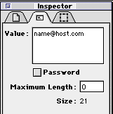
Text field optionsYou can set the Text field options using the Item panel and Form element panel in the Inspector palette.
Title (Item panel) This is the title of the item within the Freeway document. Value You can enter a default value if you wish, which will be displayed in the text field when the form is viewed. The visitor can either leave this in place, add to it or replace it with their own text. Maximum length You can prevent the visitor from entering more than a certain amount of text into the field by entering a maximum number of characters here. Size This shows you the size of the field in characters. Password Sometimes forms are used to control access into part of a site, and a password may need to be entered by the visitor. Choosing this option means that the password the visitor types appears as bullets, so that the password cannot be read by someone else watching the screen.
If the visitor is to choose from a selection of preset options, it is often most convenient to present these in the form of either a popup menu or a scrolling selection list. These are very useful if there are too many options to conveniently show as checkboxes or radio buttons. Use a popup menu if the visitor is allowed to select only one option from the list (e.g., country of residence).
Use a scrolling selection list as an alternative if you wish more of the available options to be visible at one time, or if the visitor is allowed to select more than one option at a time.
If you allow multiple selection of options in the list, turn on the Multiple Selection checkbox in the Form element panel. To then select more than one option, the visitor can hold down a modifier key (such as Shift) whilst selecting their second and subsequent choices in the list. Whether items drawn with this tool display as a popup menu or a selection list depends on the size of the box containing the form control. If the box is only large enough for the form control to show one line of text, the form control will display as a popup menu.
If the box is large enough to show two or more lines of text, the form control displays as a scrolling list.
Popup menu/Selection list options
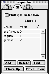
Multiple Selection Turn this on to allow multiple selections from the available options in the list. With it off, only one option may be active at a time. Size This number reflects the number of lines of text that can be displayed given the current size of the box containing the form control. Choice/Value list This list is where you specify the options that will be available for the visitor to select from. For each option, you need to give the option a name which will appear in the menu/list (Choice) and a value which will be sent back to the server if the option is selected when the form is sent (Value). Use Add to create a new Choice/Value pair, Edit or double click to modify an existing Choice/Value pair from the list in the palette, Delete to remove a Choice/Value pair. You can rearrange the order in which the options appear by selecting individual pairs in the list and using the move up or move down buttons. When you wish to control which option is the initially active one in the menu or list in the browser, you can do so by editing a Choice/Value pair and turning on the Initially Selected checkbox in the Edit Choice dialog. Only one option in a list may have this attribute turned on at one time. If you have already set one option in a list to be the initially selected choice, and repeat this for another, this attribute is automatically turned off for the previous option.
You can create larger fields for visitors to enter text into, if you wish them to provide more information than would be convenient in a one line text field - this is called a text area, and uses a separate tool. In the browser, text areas have scroll bars which become active when the user adds more text than the frame can display at one time.
Text area options
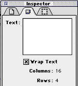
Text This field allows you to enter some default text which the visitor can either leave as it is, add to or overtype with their own text. This is optional. Columns Shows the number of characters that can be displayed horizontally at one time. Rows Shows the number of rows of text that can be displayed vertically at one time. Creating a basic form in Freeway is simple - you just draw boxes using the relevant drawing tools, and label them as appropriate to tell the visitor what information to provide. However, for the form to actually work requires a little more effort. First, you MUST create a submit button, or there will be no way for the contents of the form to be sent back to the server. Second, you must enter a Form Action into the Form Setup dialog on the Page menu. What you type into the Form Setup dialog depends on the script or program which is going to handle the form. Unfortunately it's impossible to give any more concrete guidance in these notes, as the possibilities that are available are almost unbounded. If you already know how to use forms and have access to the relevant scripts or programs, then this should be all you need to get started. If you don't, however, then you need to get some guidance now from the administrator of your Web server on what options you have for forms functionality. If you are renting Web space from an ISP, then they will often have standard programs or scripts in the PERL language which you may point your form at. Their support department will be able to tell you what's available, what they do, and what you need to include in your form to use them. Alternatively, you may have access to the server directly, or have the ability to upload your own scripts or programs to the CGI-BIN directory. This is very unusual when renting space through an ISP, for security reasons, but some do allow this. If this is the case, you will find a wide variety of scripts and programs available on the Internet, often for free, which you can use. If you need more guidance on this, contact SoftPress Support.
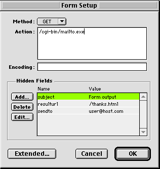
Method You can choose from two methods for sending the data in the completed form to the server, POST and GET. Unless you are told otherwise, you should always leave Method on the default option, POST. POST sends the information to the server as an actual data stream, whereas GET sends the form information as part of the URL. Action Specify the location on the Internet of the script or program which will handle the form results. Note that this can be located on any server anywhere in the world, and does not necessarily have to point to the server which is hosting your site. Normally the action is expressed as a URL. You can test your form if you wish by pointing it at one of the following URLs - this is a service run free of charge by the NCSA, and will return a page to the browser showing the information that was sent to it. You CAN NOT use this action on a form you publish on the Web, as it is the visitor who will receive the results of the form, not you! Use it only for testing forms as you construct them. For testing forms using the POST protocol: http://hoohoo.ncsa.uiuc.edu/cgi-bin/post-query For testing forms using the GET protocol: http://hoohoo.ncsa.uiuc.edu/cgi-bin/query Encoding If you wish your form to submit information in a different language encoding, you can specify the encoding type here. You do not normally need to enter any information into this field Hidden Fields Many form handling programs or scripts require additional information (parameters) to be returned along with the contents of the form. For example, a program which forwards the completed form details to an email address would require to be told which email address the completed information was to be mailed on to and the Subject line to use for the email, so you might add a couple of Hidden fields using two Name/Value pairs with the following contents; Name: Address Value: me@my.mail.com Name: Subject Value: From the Web Form |
||||
Back to the top |
|||
